Arena 2.0:Styling
The general screen layout and styling of a Liferay site is achieved by using a set of css which comprise a Theme. A theme includes a basic set up that applies to all pages. For example, it may set the number of columns, the colouring used in each column, the header bar, the way in which menus are handled, and so on. A theme may exist in different variants called Colour Schemes. Colour schemes may also include other rules within the structure set out in the theme.
Arena includes three themes. (Other themes may be available.) Each theme is designed to suit different types of functionality in Arena.
Contents |
Arena Toolbar theme
This theme includes the following settings:
- Three columns, in 20|60|20 proportions.
- A header with logo.
- A toolbar menu with tabs for the top menu levels.
- Floating width (depending on colour scheme), which ensures Arena always fills the screen area.
Toolbar has the following five colour schemes:
- Green
- Blue
- Red
- Brown
- Orange (see Elastic layouts)
Arena Classic theme
This theme includes the following settings:
- Three columns, in 20|60|20 proportions.
- Side columns of the same colour.
- A header with logo.
- Top menus in a menu portlet in the left-hand column.
- Floating width, which ensures Arena always fills the screen area.
Classic has two colour schemes:
- Blue
- Green
Arena Bird theme
This theme includes the following settings:
- Three columns, in 20|60|20 proportions.
- Side columns can have different colours.
- A header with logo.
- Top menus in a menu portlet in left-hand column.
- Fixed width. Arena does alter size to fill the screen area.
This theme has one colour scheme:
- Blue/green
Fixed width themes
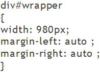
A fixed width theme is one in which the main wrapper width is fixed. This ensures that all parts of Arena will display on computer screens of limited resolution. A commonly used main wrapper fixed width is 980 pixels. At this width, Arena will display fully on a computer screen that has a resolution of 1024x768, without the need to scroll horizontally to view content that would otherwise be outside the screen area.
Vertical scrolling cannot be eliminated, as page lengths vary according to content. For example, a catalogue search may produce a long list of results.
Advantages of fixing the main wrapper width:
- The main readable content area is tightly controlled, without the need to set minimum or maximum values.
- Fixed width layouts are sometimes easier to style, depending on the effect you require. Some visual designs may only be achieved in a reasonable manner within a fixed width layout.
Disadvantages of fixing the main wrapper width:
- The text size may not be enlarged greatly. This is because the line width does not increase along with text resizing so, at large font sizes, the screen may look very untidy.
- On a 980 pixel fixed width site, users with small monitors (800×600 pixels) will need to use a horizontal scroll bar to view content that would otherwise be outside the screen area. Despite the age of such monitors, the problem is still common.
- A 980 pixel fixed width site may appear too narrow on large, wide screen displays.
Any theme in which the main wrapper width is not fixed, may be fixed by adding the some CSS to your customer CSS file (see right).
Fluid or liquid themes
A fluid or liquid theme is created by not specifying a wrapper width at all, or by specifying the wrapper width as a percentage. In other words, except for borders and padding, to which this may not always apply, a 100% width site will occupy the entire view port width, without producing a horizontal scroll bar.
Advantages of a fluid theme
- A fluid or liquid themee may adapt to almost any view port width, making it universal.
- Fluid widths match the browser default layout method.
- The fluid layout optimises use of available screen space (real estate). More content should be above-the-fold (meaning it is available without scrolling in any direction).
Disadvantages of a fluid theme
Within Arena the Arena Classic, Arena bird and Arena toolbar (green, red and brown) themes are set up using this styling choice
- A surfeit of available content, and a desire to fill empty space, may be detrimental to usability. Too much content may confuse users and clutter the site.
Elastic layouts
In an elastic site, the main wrapper and other elements are measured using the ems unit of measurement. Ems measure relative proportionality to the text or font size. In this way, as the text size is increased, the sections measured in ems will also increase in size.
The Arena toolbar orange theme is designed with this styling choice.
Advantages of an elastic theme
- If executed properly, it provides a very stable layout because, as the site is scaled up or down, everything resizes at the same rate. The result is that nothing changes disproportionally.
Disadvantages of an elastic theme
- Unless limited, this layout method may be a usability disaster. This is because it may grow in width without benefit to the user.
- When developing an elastic layout, make sure it works on small monitors, as this is where it is most likely to benefit users.
Customer styling
Customer styling may be based on any theme. Customer specific styling is placed in a special CSS file which is not overridden or removed when Arena application software is updated.
